Total assets and P&L, on the first screen
Case study
Two investors, two paths
Rebuilding how people decide to invest: redesigning a wealth app for Hong Kong and overseas investors
Lead Product Designer
4-person design team
Agency project · 2022
Mobile app
Product name changed for confidentiality
OverviewThe app had the products and the data. Users still left at the moment of purchase.
68% of users who reached the buy step left without buying.
I found two types of investors who start their decisions from opposite ends, and reorganised information and tools around each path.
Two months after launch, buy-stage drop-off fell from 68% to 42%.
68→42%Buy-stage drop-off
−28%Decision time in product research
−12%Purchase task time
+15ppAccount information comprehension
Scroll inside the phone
ContextA wealth app built to win first purchases and repeat purchases
The product and the goalsFunds and bonds for high-net-worth clients
Meridian Wealth offers funds and bonds to investors in Hong Kong and overseas, with a focus on high-net-worth clients.
As the agency design partner, we were asked to move two numbers: subscription conversion and repeat purchase rate.
The client also wanted to build brand trust in a new market.
My roleLead Product Designer in a 4-person team
I owned problem definition, research, information architecture and core interactions, and led visual design and usability testing.
I worked with the client's product, engineering, business, customer service and operations teams.
Chapter 01
Understanding the problem
3D image #2 · monolith blocking two spheres
Where users drop offUsers weren't failing to arrive. They were leaving at the point of purchase.
The client shared two months of behavioural data. I mapped it onto the user journey and compared drop-off at each step.
Exploration steps lost 35–45% of users. The buy step lost 68%, and repeat purchase lost 89%.
Drop-off by journey stage, before redesign
Biggest first-purchase loss
Other stages
Source: client behavioural data, about two months before the redesign
Simplifying the home page would not touch the biggest loss.
SurveyThe complaints pointed in opposite directions
A survey of 50 users showed what frustrated them most.
Some found the app too complex. Others found it not professional enough. These came mostly from different people.
Negative feedback by theme (50 responses)
Too complex
Not professional enough
One product, two opposite complaints: that suggested more than one kind of user.
Two investor typesTwo types of investors, divided by one thing: whether they can decide on their own
I interviewed 8 users and compared them across seven dimensions, from decision-making ability to reliance on the platform.
They split clearly into two groups. The divide wasn't how much they knew, but whether they could make an investment decision independently.
| Guided investors | Self-directed investors | |
|---|---|---|
| Decision-making | Rely on the platform or others' advice | Have their own strategy and allocation |
| Information | Prefer simple, direct explanations | Read complex data and market information |
| Risk appetite | Prefer steady returns | Higher risk tolerance |
| Usage | Low frequency, mostly checking returns | Frequent, track and act |
| Platform reliance | High | Low, use it as a tool |
Different starting pointsThey start from opposite ends, and get stuck in different places
Guided investorsThey start from a product, usually one the platform recommends.
"Is this right for me? Should I buy it?"
They get stuck on the product page. Every number is there, but nothing explains what it means for them.
Self-directed investorsThey start from the market, then screen, compare and check risk.
"Does the risk match the return? Which one fits my portfolio?"
They get stuck between the market and the product. They leave the app to check the market, then come back to find products.
The tools existed, but they were buried and shallow. Comparison only showed return curves, and screening filters were hidden in a side menu.
Both compare products and both check risk, but at different depths. Guided investors need explanation. Self-directed investors need tools.
Problem definition
The problem wasn't too much information. It was organised for neither investor's path, nor their ability.
The old app was organised by internal business modules. Markets, products and trading each lived on their own.
One structure served everyone, so each path broke in a different place.
That's why simplifying wouldn't work. Remove the explanations and guided investors are lost. Remove the tools and self-directed investors lose their evidence.
Strategy mapTwo paths, one meeting point. Fix the meeting point first.
I combined both journeys into five decision stages: platform awareness, analysis, product decision, purchase confirmation and holdings management.
The paths differ most during analysis, then converge at product decision and purchase.
I set priorities by impact on the two business goals.
1Product decision & purchase confirmation
Where first purchases are lost, and where both paths meet.
2From first impression to shortlist
The home page shows what the platform does best, and discovery decides how many users reach a decision.
3Holdings management
Drives repeat purchase. There's no repeat without a first purchase.
Chapter 02 · Strategies 01–02
Deciding to buy
3D image #3 · six glass panes
Strategy 01 · The product pageI didn't decide what the product page should show. Users' questions did.
Both groups were really asking one thing: should I buy this?
I broke it into six questions users answer in sequence, and marked who asks each one.
| Question | Tab | Who asks |
|---|---|---|
| Is it worth a closer look? | Performance | Both |
| What does it invest in? | Holdings | Self-directed |
| Is it right for me? | Analysis | Both |
| Can I trust it? | Profile | Self-directed |
| How do I buy? | Rules | Both |
| Is now the right time? | Discussion | Self-directed |
The page is now organised into six tabs in that order.
Before
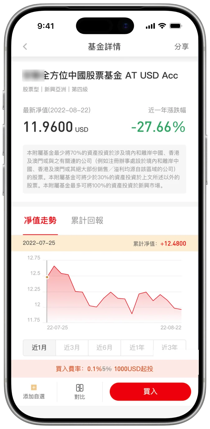
Four tabs organised by data type. No daily change, no cumulative return, no product analysis.
Strategy 01 · The product pageOne page, two depths
For guided investorsPlain-language conclusions come first.
Peer ranking and Morningstar rating sit on the first screen.
Risk statistics come with a one-line summary: "Stable, with small drawdowns", with downside resilience better than 75% of peers.
Scroll inside the phone or tap a tab to jump
For self-directed investorsDepth sits one tap away.
Returns by period, month, quarter and year. Holdings by region, sector, asset type and top 10.
Fund manager, fund size, and the original Key Facts Statement and prospectus.
ComparisonComparison is no longer buried.
Any fund can be added to comparison from the bottom bar.
Bottom bar: add to comparison anytime
−28%Average decision time in product research
+7ppTarget product success rate
Usability test with 8 users
Strategy 02 · Purchase confirmationShow each safeguard where the risk happens
In Hong Kong, risk checks are a compliance requirement. Removing steps was not an option.
So the goal was to remove searching and backtracking, not steps.
In the old flow, key information was scattered and appeared too late. Errors could only be fixed after the fact.
1Account
"Which account pays? Is there enough?"
Account and available funds shown upfront.
2Amount
"How much? Am I over the limit?"
Quick amounts and live validation of minimums and limits.
3Product & rules
"What am I buying? Fees? When is it confirmed?"
Product details expand in place, so there's no going back to check. Fees, estimated units and the confirmation timeline update as you type.
4Authorisation
"Is my money safe?"
Risk match, product documents and how your money is protected sit right before payment, confirmed with Face ID.
Before
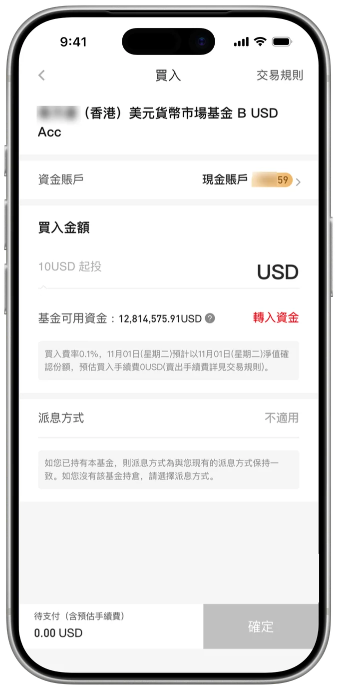
Client's original: fees buried in a note, no trading rules, no safeguards
After
Auto-playing demo of the full purchase. Tap the phone to pause
−12%Average purchase task time
Before/After prototype test, 10 users, 4 task types
Chapter 03 · Strategy 03
Finding the right product
3D image #4 · two channels into one dish
Strategy 03 · The home pageShow the platform's strengths the moment users arrive
The platform's real advantage was its fund and bond selection. On the old home page, that advantage was invisible.
The first screen was a grid of icons and mixed content, with every business entry, news and tools competing at the same level.
This mattered most at the very first stage of the journey. Both investor types start by asking whether the platform deserves their trust.
Guided
"Is this platform safe? Can I trust it?"
Self-directed
"Does this platform have quality assets and real research capability?"
With the client entering a new market, this first impression decided whether users would open an account at all.
Strategy 03 · The home pageWhat changed on the first screen
Before
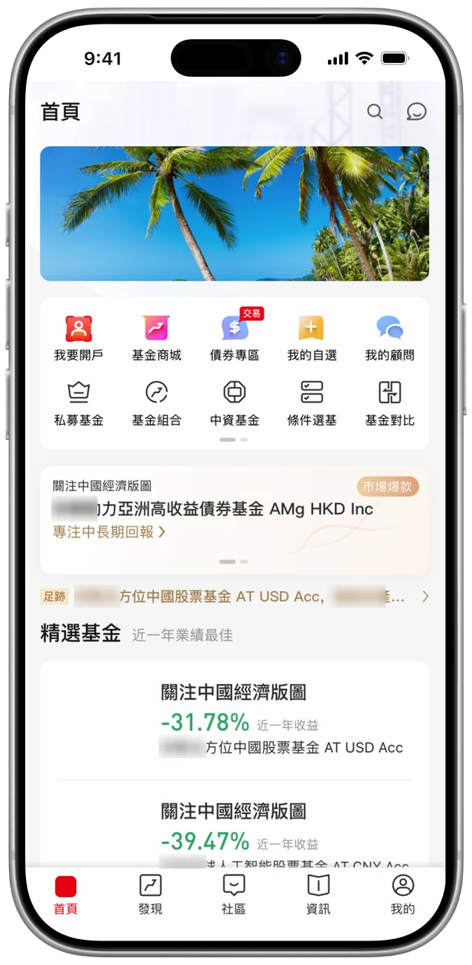
After
Scroll inside the phone and switch Funds / Bonds
DesignThe first screen, rebuilt around two flagship lines
I rebuilt the first screen around the two flagship product lines, the fund store and the bond zone, each with a one-line value statement, next to a clear account-opening entry.
A short scroll reveals curated fund recommendations with returns and rankings, so users see concrete, high-quality products straight away.
Lower-frequency content, such as news and tools, moved further down.
These recommendations are also where the guided path begins. Guided investors start from a product the platform suggests.
Adapts to the user's stageBefore and after opening an account
Before opening an account, users see the platform's strengths, its core products and a quick way to open an account.
After opening an account, they see their assets, frequent actions and market information first.
Strategy 03 · DiscoveryTwo ways in, one shortlist
Self-directed pathStart from the market.
A heat map of Hong Kong and global sectors leads to trending sectors, then straight to the funds within them.
Guided pathStart from recommendations.
Product category, then featured picks, then screening tools, then rankings.
Both paths lead to the watchlist. In finance, a watchlist is a shortlist. Users add, watch and compare before they buy.
I rebuilt it as one continuous flow: quick add, search and screen, compare, save, and group.
Browsing history lets users return to products they looked at days ago.
Before
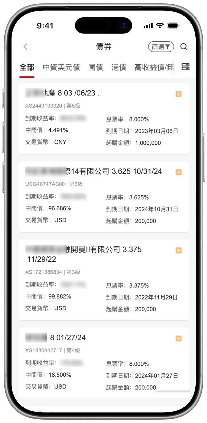
Product list: plain cards only
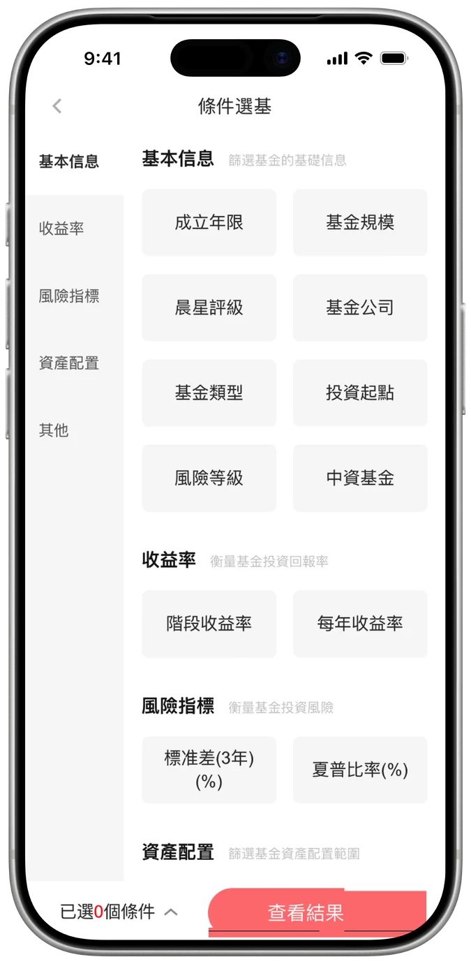
Screener: filters hidden in a side menu
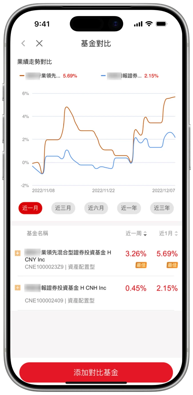
Comparison: return curves only
Auto-playing demo: screen, select, compare, save to a group. Tap the phone to pause
+12ppTarget product success
−6%Average search time
+13ppRetrieval of viewed products
+11ppOpen-ended search completion
Testing with 8 users (5 with fund-buying experience, 3 browse-only)
Chapter 04 · Strategy 04
After the purchase
3D image #5 · four layered discs
Strategy 04 · HoldingsAfter purchase, rank information by urgency, not by feature
After buying, users ask four questions: Is there anything I need to deal with? How are my assets doing? Why did my returns change? Which transaction was this?
The old app placed all of this side by side, competing for the same attention. The legacy fund management page didn't even show total assets.
I ranked every piece of information by time sensitivity and decision impact.
Before
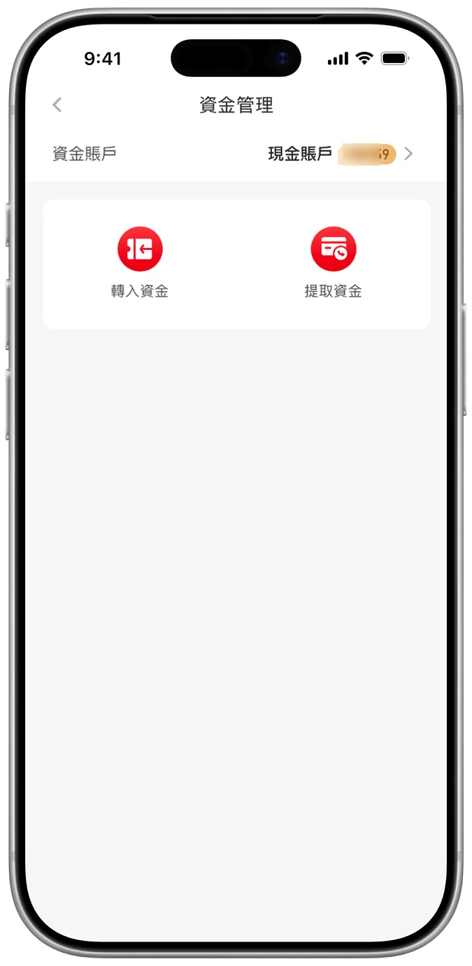
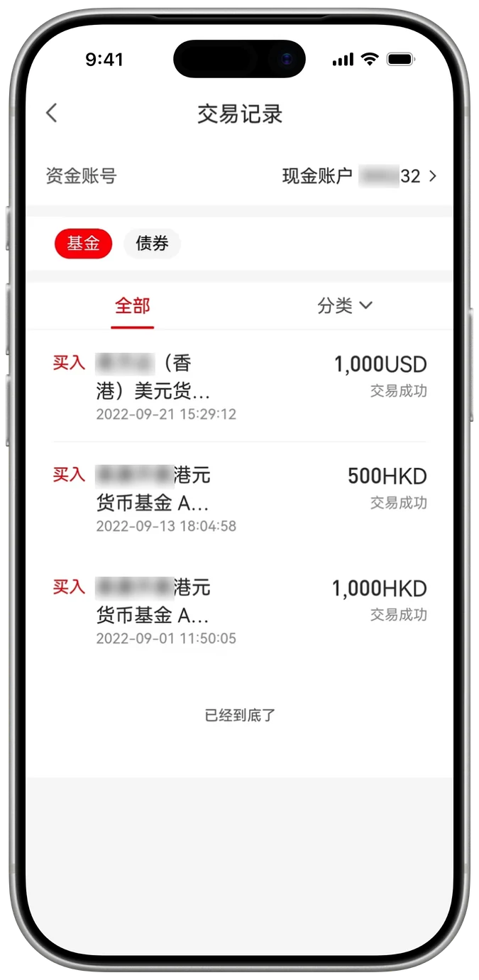
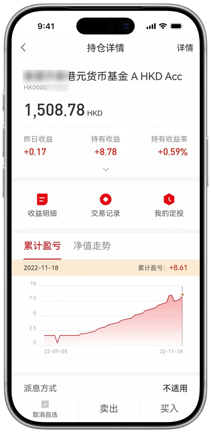
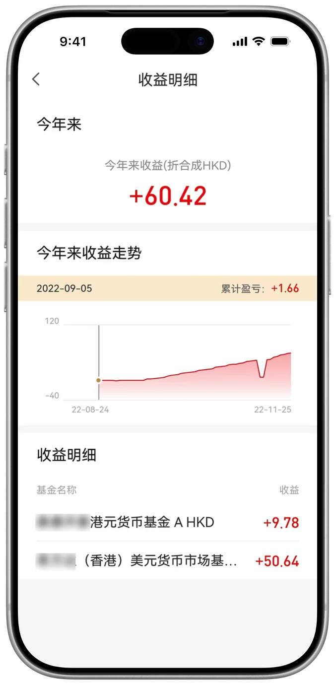
Four separate pages, and none of them showed total assets.
P2Assess now
P1Act now
Pending orders, right below total assets
P4Verify
Transaction and dividend history, on demand
P3Understand
What drove returns, and each product's contribution, expandable
Auto-playing demo. Tap the phone to pause
+14ppPending order discovery
+15ppAccount information comprehension
−26%Average search time
Testing with 10 users across 4 tasks
ResultsBuy-stage drop-off fell from 68% to 42%
68% → 42%
Two months after launch, buy-stage drop-off fell from 68% to 42%. For every 100 users who reached the buy step, 58 now completed a purchase, up from 32.
Repeat-purchase drop-off fell from 89% to 75%.
Drop-off before and after the redesign
Before redesign
Two months after launch
AttributionNot all of this is design
The client ran a large market-entry campaign in the same period, and there was no control group.
These numbers reflect design, operations and marketing together. Repeat purchase, in particular, is more directly affected by campaigns.
The design contribution I can stand behind comes from usability testing: users found products more accurately, decided faster, and completed purchases sooner.
Source: client behavioural data, two months after launch
Reflection
Less information was never the answer
I started out seeing "too much information". The real problem was one structure trying to serve investors who start from opposite ends.
PrincipleIn complex products, the job isn't to show less. It's to give each user, on their own path, just enough to take the next step.
What's nextThis redesign helped them see clearly. The next step is helping them decide.
Repeat-purchase drop-off is still 75%. After buying, self-directed investors ask: "Is my portfolio still right? Should I rebalance?"
I'd also build a control group into the launch, so design impact can be measured on its own.
Appendix
- Phased onboarding for the 2.0 release
- Design system and light/dark themes